Multivariate Data
by mervyn
source
“K-MOOC 오세종 교수님의
Scatter Plot
A graph that shows the distribution of bivariate data. Correlation between two variables Wide range of parameters
wt<- mtcars$wt
mpg<- mtcars$mpg
# x axis, y axis
plot(wt, mpg,
main="Car Weight-mpg",
xlab="car Weight",
ylab="Miles Per Gallon",
col="red",
pch=19)
pch: type of point plot(): 2 dimensional graph, only shows the relationship between two variables pairs(): Show correlations between multiple variables
vars<- c("mpg", "disp", "drat", "wt")
target<- mtcars[,vars]
pairs(target, main="multi plots")
iris.2<- iris[,3:4] # data
point<- as.numeric(iris$Species) # point shape
color<- c("red", "green", "blue")
plot(iris.2,
main="Iris plot",
pch=c(point),
col=color[point])
Assignment
-
Use dataset cars, draw scatter plot on speed and dist (x axis: spped) Explain correlation between speed and dist.
-
Use dataset pressure, draw scatter plot on temperature and pressure. (x axis: temperature) Explain correlation between two variables.
-
Use dataset state.x77, draw scatter plot on population, income, illiteracy, area. Observe correlation. (use pairs() function)
-
In dataset iris, distribution of Sepal.Length, Sepal.Width by Species.
# 1
speed<- cars$speed
dist<- cars$dist
plot(speed, dist,
     main="Car Speed-dist",
     xlab= "Car Speed",
     ylab= "Car dist",
     col="red")
# As speed increases, dist also increases

# 2
temperature<- pressure$temperature
pressure<- pressure$pressure
plot(temperature, pressure,
     main="Pressure-Temperature",
     xlab="Temperature",
     ylab="Pressure",
     col="blue")
# As temperature increases, pressure increases exponentially.

# 3
vars<- c("Population", "Income", "Illiteracy", "Area")
target<- state.x77[,vars]
pairs(target, main= "multi plots")

# 4
head(iris)
iris.2<- iris[,1:2]
Species<- iris$Species
point<- as.numeric(Species)
color<-c("red", "green", "blue")
plot(iris.2,
     main="Length & Width by Species",
     pch= c(point),
     col= color[point])
Correlation Analysis
Two variables, two quantitative data analysis. Always used with scatter plots. Numerical representation of two variables.
Correlation Coefficient r
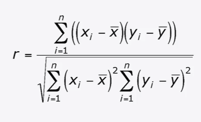
Properties of r
- Distributed \(-1\leq r\leq 1\)
- \(r>0\): positive correlation
- \(r<0\); negative correlation
- \(\lvert r\rvert\): closer to 1, higher (stronger) correlation. Closer to 0, lower (weaker) correlation.
Straighter the line is, the closer \(\lvert r\rvert\) to 1
beers=c(5,2,9,8,3,7,3,5,3,5)
bal=c(0.1, 0.03, 0.19, 0.12, 0.04, 0.095, 0.07, 0.06, 0.02, 0.05)
tbl=data.frame(cbind(beers, bal))
tbl; class(tbl)
plot(bar~beers, data=tbl) # scattered plot. plot(x, y)=plot(y~x)
res=lm(bal~beers, data=tbl) # regression equation. used to draw a line to find out what linear correlation between x and y
# lm(): identify the line(regression equation)
abline(res) # abline(): draw a regression line
cor(beers,bal) # cor(): correlation analysis. calculate correlation coefficient
point at the bottom: the person with a low blood alcohol level point at the top: the person with the highest blood alcohol level.
The faster you can digest alcohol, the lower your blood alcohol level will be
If \(\lvert r\rvert\) > 0.5, we think there is a correlation.
data.frame: makes data into data frame cbind(): combine two vectors in column direction rbind(): combine two vectors in row direction plot(): plot(tbl), plot(tbl[,1], tbl[,2]) return same result.
Find Correlation Coefficients of multiple variables simultaneously
cor(iris[,1:4]) # analyze correlation between 4 variables
Assignment
| Income | Years of Education |
|---|---|
| 125,000 | 19 |
| 100,000 | 20 |
| 40,000 | 16 |
| 35,000 | 16 |
| 41,000 | 18 |
| 29,000 | 12 |
| 35,000 | 14 |
| 24,000 | 12 |
| 50,000 | 16 |
| 60,000 | 17 |
Analyze correlation between income and years of eduation (Scattered Plot, Correlation coefficient)
2.
| GPA | TV in hours per week |
|---|---|
| 3.1 | 14 |
| 2.4 | 10 |
| 2.0 | 20 |
| 3.8 | 7 |
| 2.2 | 25 |
| 3.4 | 9 |
| 2.9 | 15 |
| 3.2 | 13 |
| 2.7 | 4 |
| 2.5 | 21 |
Analyze correlation between grade and TV watch. (Scattered Plot, Correlation Coefficient)
[CSV file](/assets/Lc5_2_2.csv
# 1
mydata<- read.csv(file.choose(), header=TRUE)
is.vector(mydata)
is.data.frame(mydata)
mydata; class(mydata) # show mydata
plot(mydata)
corr1<- plot(mydata)

# 2
mydata<- read.csv(file.choose(), header=TRUE)
is.vector(mydata)
is.data.frame(mydata)
plot(mydata)
corr2<- plot(mydata)
Line Graph
Used when one of the variables is time: Time Series Analysis.
month=1:12
late=c(5, 8, 7, 9, 4, 6, 12, 13, 8, 6, 6, 4)
plot(month, # x data # time data
     late, # y data # late students data
     main="Late students", # title of graph
     type="l", # type of graph (in alphabet)
     lty=1, # Line type
     lwd=1, # boldness of line
     xlab="Month", # x axis label
     ylab="Late cnt") # y axis label
type=”l”: line type=”b”: dotted line type=”s”: ladder line type=”o”: overlapped dots and line type=”h”: vertical line for value type=”S”: ladder line 2
Line type
No.1: ‘solid’
No.2: ‘dashed’
No.3: ‘dotted’
No.4: ‘dotdash’
No.5: ‘longdash’
No.6: ‘twodash’
Drawing Multiple Line Graphs
- overlapping line graphs
plot(month, # first graph # x data
     late1,		  # y data
     main="Late students",
     type="b",		  # type of graph
     lty=1,		  # line type
     col="red",		  # color of line
     xlab="Month",
     ylab="Late cnt")

lines(month,    # overlapping graph
      late2,
      type="b",
      col="blue")
If there are multiple variables, we can represent as a graph by keep adding line function.
Assignment
-
Draw a line graph
-
Draw a line graph
Year= 2015:2026
Total.Population=c(51014, 51245, 51446,
                   51635, 51811, 51973,
                   32123, 52261, 52338,
                   52504, 52609, 52704)
plot(Year,
     Total.Population,
     main="Predicted Population",
     type="l",
     lty=1,
     lwd=1,
     xlab="Year",
     ylab="Population")


Year=c(20144, 20151:20154,
      20161:20164, 20171:20173)
Male=c(73.9, 73.1, 74.4,
       74.2, 73.5, 73.0,
       74.2, 74.5, 73.8,
       73.1, 74.5, 74.2)
Female=c(51.4, 50.5, 52.4,
         52.4, 51.9, 50.9,
         52.6, 52.7, 52.2,
         51.5, 53.2, 53.1)
plot(Year, Male,
     main="Economic Activity",
     type="b",
     # lty=1,
     col="red",
     xlab="Year",
     ylab="Participation")
lines(Year, Female,
      type="b",
      col="blue")
Data Analysis Example: iris
- Dataset general information
str(iris) # all information
class(iris) # data structure
head(iris) # front matters of the data
dim(iris) # number of row and column
table(iris$Species) # how many measurements of species and how many samples
- Data distribution for each column
summary(iris[,1]) # min, max, median, mean values
summary(iris[,2])
summary(iris[,"Petal.Length"])
summary(iris$Petal.Width)
sd(iris[,1]) # Sepal.Length
sd(iris[,2]) # Sepal.Width
sd(iris[,3]) # Petal.Length
sd(iris[,4]) # Petal.Width
min/max
- range of data
- distribution range
mean/median
- average value of data
- if mean & median is similar(identical): complete normal distrition
- if wide gap between two: leans toward something
sd(): range of distribution
- small: variables are clustered together on the average
- big: widely distributed on the average
- Data distribution of each column by group Use boxplot
par(mfrow=c(2,2))
boxplot(Sepal.Length~Species, data=iris,
        main="Sepal.Length")
boxplot(Sepal.Width~Species, data=iris,
	main="Sepal.Width")
boxplot(Petal.Length~Species, data=iris,
	main= "Petal.Length")
boxplot(Petal.Width~Species, data=iris,
	main="Petal.Width")
- Data distritbution of each column by group Using scatter plot
point<- as.numeric(iris$Species)
color<-c("red", "green", "blue")
pairs(iris[,-5],
      pch=c(point),
      col=color[iris[,5]]
)
if two colors are mixed, we can not distinguish two species with that data. if the color is separated from others, the species is different with others.
cor(): positive, negative, strong, weak correlation
Assignment
- Analysis dataset state.x77 Add state.region to state.x77
Hint:
st<- data.frame(state.x77, state.region)
head(st)
st<- data.frame(state.x77, state.region)
head(st)

# Step 1
str(st)
class(st)
table(st$state.region)

# Step 2
summary(st[,1]) # Population
summary(st[,2]) # Income
summary(st[,"Illiteracy"])
summary(st$Life.Exp)
sd(st[,5]) # Murder
sd(st[,"HS.Grad"])

# Step 3
par(mfrow=c(2,2))
boxplot(Frost~state.region,
        data=st,
        main="Frost by State")
boxplot(Population~Area,
        data=st,
        main="Population by Area")

# Step 4
point<- as.numeric(st$state.region)
Murder<- st$Murder
Income<- st$Income
Illiteracy<- st$Illiteracy
Life.Exp<- st$Life.Exp
HS.Grad<- st$HS.Grad
color<- c("red", "green", "blue", "yellow", "grey")
pairs(Murder~Income+Illiteracy+Life.Exp+HS.Grad,
      pch=c(point),
      col=color[point])
Comments
Post comment