Univariate Data Exploration and Analysis
by mervyn
source
“K-MOOC 오세종 교수님의
Basic Statistics
By data chracteristics Qualitative Data: (Categorical Data) Data that is not composed of numbers, or expressible by any kind of size.
Quantitative Data: Data that has been quantified to numbers with specific sizes.
Discrete Data: Data in integers. Continuous Data: Data with decimals.
By number of variables Univariate Data: Data with one variable. Stored in vector.
Multivariate Data: Data with more than two variables. Stored in matrix, data frame.
Terminology
Population: the entirety of groups that we are interested in, and would like to analyze. Sample: part of the population that could represent the entire group. Subset of the population. Error: wrongness of sampling Population parameters: standards that show the characteristics of specific population. Means, standard divisions.
| Number of variable | Variable type | Graph |
|---|---|---|
| Continuous data | Histogram kernel Densisty Curve Box Plot Violin Plot |
|
| Categorical data | Bar Chart Pie Chart |
|
| Continuous data | Scatter Plot Line Plot Time Series Plot |
|
| Categorical data | Mosaic Chart |
Univariate Qualitative Data Analysis
For qualitative data, counting is the first step.
- table(): create Frequency Distribution Table length(): length of vector (total number) table()/length(): ratio of data
ans=c("Y", "Y", "N", "Y", "Y")
table(ans)
table(ans)/length(ans) # returns N, Y ratio
- Create Bar Graph Store data as vector
Store frequency distribution table using table()
barplot(): create bar graph
favorite.color<- c("red", "green", "yellow", "red", "green", "red", "red")
sum<- table(favorite.color)
sum # frequency distribution table
barplot(sum, main="Favorite color") # main: graph title
Bar Graph
head(mtcars)
carb<- mtcars[,"carb"] # extract number of carburetors
table(carb) # carb is a vector. As we can COUNT the models with one carburetors, even though carb is quantitative data, we can use it for bar graph
barplot(table(carb), main="Barplot of Carburetors", xlab="#of carburetors", ylab="frequency")
# xlab: x axis label, ylab: y axis label
barplot() parameters
| instance | explanation |
|---|---|
| angle, density, col | slope, density of shading lines, colors of bars |
| legend | legend for the plot |
| names | label for each bar |
| width | bar widths |
| space | space between bars |
| beside | TURE: columns are portrayed as juxtaposed bars |
| horiz | TRUE: horizontal bar |
Multiple Graphs in one Screen
par(mfrow=c(1,3)) # divide the screen virtually, divide to 1*3
barplot(table(mtcars$carb),
main="Barplot of Carburetors",
xlab="#of carburetors",
ylab="frequency",
col="blue")
Create Pie Graph
favorite.color<- c("red", "green", "yellow", "red", "green", "red")
sum<- table(favorite.color)
pie(sum, main="Favorite color")
Assignment
-
Extract education column of infert dataset. Store it to edu, and show value of edu.
-
Show value of edu without overlaps
-
Show frequency distributed table of edu values
-
Show bar graph of edu values
edu<- infert[,"education"]
edu
unique(edu)
table(edu)
barplot(table(edu), main="Bar Plot of Education")
Univariate Quantitative Data Analysis
Quantitative data has various analysis methods. First step is to calculate mean/median
Mean (or Median): Characteristics of data Trimmed Mean: Mean of (100-2n)%. Calculated after sorting out the values that are too high or too low. Median is useful for when it is not nomal distribution.
Quartile: Q1, Q2(=Median), Q3
mydata = c(50, 60, 100, 75, 200)
mydata.big= c(mydata, 50000)
mean(mydata)
mean(mydata.big)
median(mydata)
median(mydata.big)
mean(mydata, trim=0.2)
mean(mydata.big, trim=0.2)
quantile(mydata)
quantile(mydata, (0:10)/10)
summary(mydata) # min, max, mean, median
fivenum(mydata)
- Distribution
- The way the data is dispersed, or spread.
- Variance and Standard deviations
- How far from the mean?
Large variance or standard deviation \(\rightarrow\) data well away from the average.
diff(): DIfference var(): Variance sd(): Standard deviation
diff(range(mydata)) # range(): max, min of the data. Small diff() value means data dispersed over a small area
var(mydata) #
sd(mydata) #
Box Plot
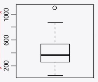
head(state.x77)
st.income<- state.x77[, "Income"]
boxplot(st.income, ylab="Income value")
boxplot(Petal.Width~Species, data=iris, ylab="Petal.Width") # ~Species: Petal.Width by Species
Histogram
Approximate representation of the distribution of numerical data
st.income<- state.x77[,"Income"]
hist(st.income, main="Histogram for Income",
xlab="income",
ylab="frequency",
border="blue",
col="green",
las=2, # x axis range
breaks=5) # number of bars
Stem-and-Leaf Plot
score<- c(30, 40, 50, 100, 90)
stem(score, scale=2) # number of data by score range. scale: number of stem
Assignment
Course Score |KOR|ENG|MATH|HIST|SOC|MUSIC|BIO|EARTH|PHY|ART| |–|–|–|–|–|–|–|–|–|–| |90|85|73|80|85|65|78|50|68|96|
-
Store the data into score vector (course names as data name)
-
Show score vector
-
Mean of score
-
Median of score
-
Show standard deviation of score
-
Show the name of course with highest score
-
Draw boxplot for score. Show an outlier course.
-
Draw histogrem for score. Title: Hong’s score, Color of bar: Purple
mtcars dataset
-
Mean, Median, Trimmed Mean(15%), Standard Division of weight(wt)
-
summary() of weight(wt)
-
Frequency distribution table for number of cylinders (cyl)
-
Draw a frequency distribution table into bar graph
-
Draw a histogrem of weight(wt), bar graphs for cylinder(cyl), gear(gear) in one screen
-
Draw a boxplot of weight(wt). What can you observe from the boxplot?
-
Draw a boxplot for displacement(disp). What can you observe from the boxplot?
score<-c(90,85,73,80,85,65,78,50,68,96)
names(score)<-c("KOR", "ENG", "MATH", "HIST", "SOC", "MUSIC", "BIO", "EARTH", "PHY", "ART")
score
mean(score)
median(score)
sd(score)
colnames(max(score))
boxplot(score, main="Hong's score",
        col="Purple")

wt<- mtcars[,"wt"]
mean(wt)
median(wt)
mean(wt, trim=0.15)
sd(wt)
summary(wt)
cyl<- mtcars[,"cyl"]
table(cyl)
barplot(table(cyl))
gear<- mtcars[,"gear"]
par(mfrow=c(1,3))
hist(score)
barplot(cyl)
barplot(gear)
boxplot(wt)
disp<- mtcars[,"disp"]
boxplot(disp)
Tips
paste(): combines a number of characters to create a unified sentence sep: separator substr(): substring. Split the strings. nchar(): number of character. Length of a string. gsub(): replace
paste("Good", "Mornig", "Tom", sep=" ")
paste(1:10, "is good", sep=" ") # 1 is good, 2 is good, 3 is good, etc
str<- "Good Morning"
substr(str, 1, 4) # "Good"
substr(str, 6, nchar(str)) # "Morning"
gsub("Good", "nice", str) # "nice Morning"
str<- gsub(" ", "/", str) # store change to str
str # "Good/Morning"
Comments
Post comment